Hi, this is Showkaku Sano. I've recently been buying used smartphones and cameras to use as secondary devices. It's often the case that they work perfectly fine, and it's fun to find compact, good-condition items for a low price.
Here are the updates for September. This month, I focused on improving the thumbnail display. To update your theme, please refer to the help guide, “Update the Theme.”
I’m on X and Instagram!
I’ve also been steadily posting on social media:
On X, I share portfolio tips 2–3 times a week
On Instagram, I post weekly photos that capture everyday moments with Lumina
If you haven’t followed yet, now’s a great time to check them out:
X (Tips): https://x.com/sanographix
Instagram (Photos): https://www.instagram.com/illustfolio_lumina/
Now Supporting Video Autoplay

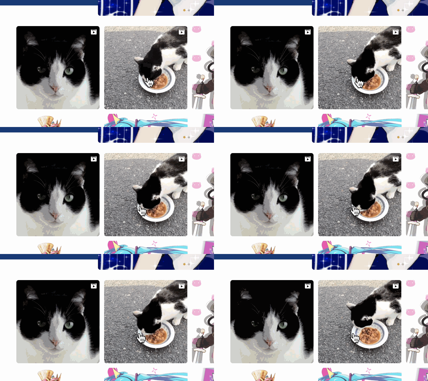
Videos on the top page will now autoplay when you hover your mouse over them.
With this update, you can now see a video's content just by hovering over it, whereas before you had to click to see what was inside.
For example, you can show your illustration process with a timelapse or post a simple animation. This allows you to showcase your technical skill and creative range in a way that can't be fully conveyed with still images alone. If you've never posted a video before, I encourage you to give it a try!
Please note, this feature only applies to videos uploaded directly to Tumblr. Videos from external services like YouTube will not autoplay.
Icon for Multi-Image Posts

A dedicated icon will now appear on the top right of multi-image posts on the top page. This intuitively tells visitors that they can view multiple images by clicking the post.
For multi-image posts, only the first image is displayed as a thumbnail on the top page. I recommend continuing to post your main works, the ones you want to be the 'face' of your portfolio, as single-image posts.
Please use the multi-image post feature for things like a series of related illustrations or to show your creative process from rough sketch to final piece.
Other Updates
Updated internal build scripts.
For the full update history, please check the release notes.
Short Story
This time, I'd like to talk about how to choose a font.
I've previously posted on X about "Recommended Web Fonts for Lumina." But nobody ever really teaches you what to look for when choosing a web font, do they?
If I could share one key perspective on how to choose, it's this:
"A truly sophisticated font looks surprisingly plain."
Let's use an analogy with choosing clothes. A flashy, eccentric piece of clothing might look good on its own, but it can clash with the rest of the outfit and stand out in a bad way. Fonts are the same. If a font is too stylized, it creates friction when reading and can lead to an impression of being "hard to read" or "feeling off." That's why it's so important to choose a font that is "plain, but good."
If you're stuck on which font to choose, try setting a long passage of text with it and looking at it from a distance. Does the meaning flow into your mind without any stress?
For example, take "Lato" and "Montserrat" from Google Fonts. At a glance, they both look very plain. But if you look closely, you'll see differences in the shape of the letter 'g', and in their overall roundness or sharpness. This slight difference in shape is what can change the entire feel of your site, making it softer or more intellectual. Please try to choose with this kind of delicate sensibility.
If you still can't decide, try starting with the four fonts I mentioned in the X post I referred to earlier. If you use them as a baseline, you'll gradually get a feel for what fits your site best.
That’s it for this month’s newsletter! If you haven’t purchased the theme yet, you can get it here!
See you next time!


